
Have you ever wondered why certain websites instantly catch your eye while others leave you feeling indifferent? The answer might lie in the careful selection of their color palette.
You see, colors beautify a website, evoke emotions, influence perceptions, and drive actions. In this article, we’ll delve deep into the psychology of color in the web design process to help you understand what colors communicate and how they generate emotional responses.
We’ll explore how integrating brand recognition with color can affect your site’s success. From theories to advanced design tools that aid in choosing the right palette, we’ve got you covered.
Plus, we’ll simplify it all with the 60-30-10 rule and guide you through selecting primary and contrasting colors that highlight your website’s crucial elements effectively.
So buckle up for a colorful journey that’s set to transform not only your website but also its user experience!
What Does Color Mean or Communicate?

When you’re picking out colors for your website, you’re not just choosing pretty hues – you’re communicating messages and evoking emotions in your audience.
Imagine the calm serenity of a soft blue color scheme or the energetic vibrance of a bold red palette; each color tells its own story.
Ever wonder why most fast food logos are red and yellow? It’s because these colors stimulate appetite and create urgency.
On the other hand, banks often use blues to communicate trustworthiness and stability.
Your choice should depend on what feelings you want to evoke in your users. Do you want them to feel relaxed or excited? Secure or adventurous?
Understanding the psychology of colors can help guide your choices, crafting an effective digital experience through smart and creative design decisions.
Generate an Emotional Response
It’s crucial to understand that different hues can evoke various emotional responses from your audience, effectively shaping their perception of your online platform.
For instance, red often stirs feelings of excitement or urgency, making it a popular choice for call-to-action buttons. On the other hand, blue usually fosters trust and calmness—a reason why many financial institutions use it.
Pay attention to how these color-emotion associations can impact user behavior on your website. If you’re seeking to create an environment of relaxation and tranquility, consider incorporating shades of green. Meanwhile, yellow tends to stimulate cheerfulness and optimism—perfect for brands that want to project positivity.
Ultimately, the key is strategically selecting colors that align with your brand’s personality and goals while also resonating emotionally with your target audience.
Color Psychology and Integrating Brand Recognition
The proper utilization of color plays a vital role in enhancing brand engagement on a website. Not only does it capture attention, but it also generates desire, increases conversions, and fosters customer loyalty. Through the strategic choice of colors, a user can easily recognize a familiar brand, even in the absence of its logo.
As you carefully craft your brand’s online presence, remember that the shades and tones you pick can become synonymous with your identity, instantly sparking recognition among your audience. Color psychology plays a pivotal role here. The right palette doesn’t just look good—it forms an emotional connection with your viewers, leading to higher brand recall.
When choosing colors for your website, consider how they align with your brand message and values. Prioritize consistency across digital touchpoints to reinforce that mental association in users’ minds, bolstering recognition over time.
Color Theory and Web Design
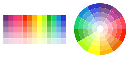
Understanding the fundamentals of color theory can significantly enhance your digital interface’s aesthetic and functional appeal. It’s more than just picking colors at random; it involves a thoughtful process to create harmony, guide user focus, and communicate effectively.
1. Complementary Colors: Opposite each other on the color wheel, complementary colors offer a high contrast effect that effectively highlights and emphasizes objects.
2. Analogous Colors: These are next to each other on the color wheel. They provide a harmonious feel but with enough distinction to differentiate elements.
3. Triadic Colors: A triadic palette uses three colors evenly spaced around the wheel for vibrant yet balanced designs.
Remember, strategically applying color theory in your business web design project enables you to manipulate viewer emotions, direct attention, and control actions – all crucial for audience engagement.
Using Tools to Help Choose a Color Palette
Selecting the perfect hues for your digital interface doesn’t have to be a guessing game. There are numerous tools available that can simplify this process and ensure you’re making effective choices.
Take advantage of online resources like Adobe Color CC, which lets you explore color combinations using color theory principles. You can use it to create complementary, analogous, or monochromatic palettes.
Similarly, Coolors is a user-friendly tool that generates harmonious color schemes with just a click. It even allows you to adjust saturation and brightness levels for each hue.
A professional designer can assist in selecting a color palette for your website by considering your brand identity, target audience, and industry trends to create a cohesive and visually appealing design. They can also utilize their knowledge of color psychology to ensure the chosen colors evoke the desired emotions and enhance the overall user-friendly experience.
Don’t underestimate the power of these tools; they often provide an intuitive understanding of how different colors relate and interact with each other, which is critical in creating visually appealing and responsive web designs.
Keeping it Simple: The 60-30-10 Rule
Having explored various tools to help select a color palette, let’s now simplify the process even further.
You’ve probably heard of the 60-30-10 rule in interior design; well, it applies to web design, too. This rule suggests using three colors in varying degrees: 60% for your dominant hue, 30% for the secondary color, and 10% for an accent color. It’s a formula that can take out some of the guesswork when choosing your website’s colors.
The dominant color sets the tone of your site, while the secondary color supports and complements it. The accent color is used sparingly to draw attention to important elements or create contrast.
Keep this rule in mind; simplicity often leads to visually pleasing results.
Highlight the Important Elements of Your Website
Don’t forget, it’s essential to use your chosen hues effectively to highlight the key features of your site. A well-thought-out color scheme can direct users’ attention towards specific elements you want them to interact with.
Here are some critical tips on using color for emphasis:
- Use contrasting colors to make crucial buttons and calls to action stand out.
- Apply a distinctive color for hyperlinks so they’re easily identifiable.
- Emphasize section headings by using bold or darker shades.
- Leverage white space around important elements; it gives breathing room and aids visual focus.
Remember, the goal is not just to make your website attractive but also to guide potential customers intuitively through their journey on your site. Every hue employed should serve a purpose in enhancing a user-friendly experience.
Get High-Quality Web Design with Effective Web Solutions
When it comes to custom web design services, Phoenix business owners understand the urgency of having a strong online presence. In a competitive market, potential customers will quickly turn to a competitor if they cannot find your business’s website and services online. However, this ever-evolving online marketing landscape also presents significant opportunities for growth. The importance of a professionally designed website for a business cannot be emphasized enough. To compete in today’s bustling online marketplace, companies must have modern, user-friendly websites that incorporate search engine optimization. At Effective Web Solutions, our digital marketing specialists and SEO experts leverage SEO strategies based on thorough testing and progressive web designs to create interactive websites that propel businesses forward.
Advanced marketing services we provide for your business:
- SEO Integration
- Internet Marketing
- Attractive Web Design
- Google Adwords
- Email Marketing
- Social Media Marketing
- Remarketing
- And More
Contact us today so we can get started on designing your new website!